Documentation
Table of contents
- Installation
- Page templates
- Block Areas
- Block templates
- Containers
- Skins
- Custom Colors
- Content-Block custom styles
1. Installation
1.1 Marketplace installation
Connect to the community in the dashboard (System & Settings -> Marketplace) and install the package.
Go to Extend Concrete -> Add Functionality and install the Theme.
1.2 Manual installation
Unzip the file in your packages/ directory of your Concrete5 installation.
Go to Go to Extend Concrete -> Add Functionality and install the Theme.
2. Page templates
Nyx comes with the following page templates:
3. Block Areas
3.1 Block Areas - Full Page template:
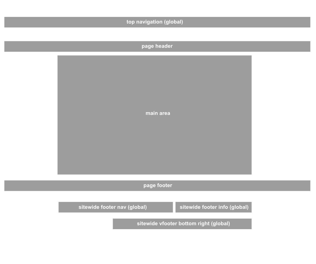
The full page template provides the following block areas:
- top navigation (global)
Block area for the navigation/Autonav block (spans over the entire width) - page header
This area spans over the full width of your site. It's suitable for hero sections or images sliders. - Main area
Area for you main content. - Page footer
just like the page header this area spans over the full width of your site. - sitewide footer nav (global)
top left area inside the footer - sitewide footer info (global)
top right area inside the footer -
sitewide footer bottom right (global)
bottom right area inside the footer. Uses approx. 2/3 of the width.
*the contents of global areas are reused on all pages.
The copyright on the bottom left of the footer always displays the current year and the name of your site set in your site settings (Dashboard -> System & Settings -> Basics -> Name & Attributes)
3.2 Block Areas - sidebar left template:
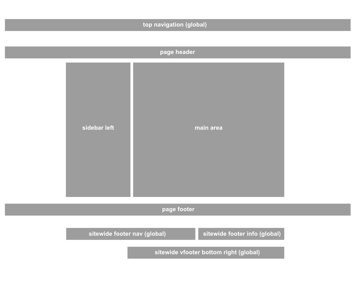
The sidebar-left AND sidebar left offcanvas provide the following block areas:
- top navigation (global)
Block area for the navigation/Autonav block (spans over the entire width) - page header
This area spans over the full width of your site. It's suitable for hero sections or images sliders. - sidebar left
Area to the left alongside the main content area. - Main area
Area for you main content. - Page footer
just like the page header this area spans over the full width of your site. - sitewide footer nav (global)
top left area inside the footer - sitewide footer info (global)
top right area inside the footer -
sitewide footer bottom right (global)
bottom right area inside the footer. Uses approx. 2/3 of the width.
See this page for more information about the sidebar-offcanvas functionality
*the contents of global areas are reused on all pages.
The copyright on the bottom left of the footer always displays the current year and the name of your site set in your site settings (Dashboard -> System & Settings -> Basics -> Name & Attributes)
3.3 Block Areas - sidebar right template:
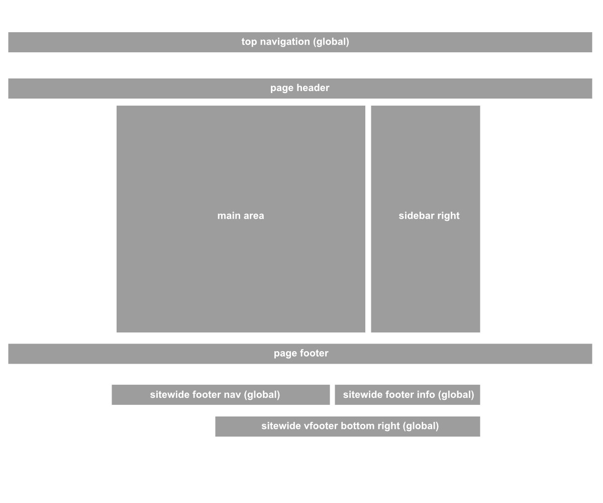
The sidebar right AND sidebar right offcanvas provide the following block areas:
- top navigation (global)
Block area for the navigation/Autonav block (spans over the entire width) - page header
This area spans over the full width of your site. It's suitable for hero sections or images sliders. - sidebar right
Area to the right alongside the main content area. - Main area
Area for you main content. - Page footer
just like the page header this area spans over the full width of your site. - sitewide footer nav (global)
top left area inside the footer - sitewide footer info (global)
top right area inside the footer -
sitewide footer bottom right (global)
bottom right area inside the footer. Uses approx. 2/3 of the width.
See this page for more information about the sidebar-offcanvas functionality
*the contents of global areas are reused on all pages.
The copyright on the bottom left of the footer always displays the current year and the name of your site set in your site settings (Dashboard -> System & Settings -> Basics -> Name & Attributes)
04. Block templates
Hemera-theme comes with custom block templates for most of the core blocks.
Currently Hemera-Theme provides templates for the following blocks:
- autonav
- breadcrumbs
- content
- conversation
- date navigation
- document library
- FAQ
- feature
- feature-link
- file
- gallery
- hero image
- image slider
- next/previous navigation
- page list
- rss displayer
- search
- share this page
- survey
- testimonial
- top navigation bar
- topic list
Additionally the following blocks provide more than one template:
4.1. content block
default
the default content block template
hemera CallToAction
this content block template styles the content as a call to action element.
hemera CallToAction_2
this content block template styles the content as a second call to action element.
4.2 Pagelist
Hemera LargeGridlist
a two column grid pagelist.
Hemera SmallGridList
a four column grid pagelist.
Hemera HorizontalGridList
horizontal aligned pagelist
Hemera Basic List
basic list styling. Suitable for sidebar lists and navigations
Hemera Adv.PageList
a basic list styling with additional content: intro-text and date. suitable for sidebar lists and navigations as well as main content pagelists.
Basic List
a very basic list with no styling.
4.3 Search
Basic search (default)
A basic search field
Hemera SidebarSearch
Search field suitable for use in a sidebar or other confined spaces. The block title stacks on top of the search field.
4.4 Share this page
default
Default icons next to each other
Hemera Share Small
Displays a share button with the links inside a dropdown.
4.5 Hero image
Hemera Hero Image (default)
Responsive image with horizontally and vertically centered text and button. Darkens the image to improve readability.
Hemera Hero Image 2
Responsive image with left aligned text and button. Does not darken the image.
4.6 Autonav
Hemera Sidebar-Nav
Vertical menu for sidebar use.
Hemera HorizontalNav
Horizontal Menu, displaying the child pages beneath their parents. Can be used in footer sections.
5. Containers
"Containers are pre-designed sections that allow you to arrange blocks in complex layouts, enhancing the design and functionality of your pages. They provide a structured way to group content, ensuring consistency across your site and allowing for sophisticated page designs without extensive custom coding."
-- Concrete5 Documentation
Hemera-Theme ships with four containers:
1. two column container
Creates two columns each with their own block-area. On mobile devices the left column stacks on top of the right column.
The content is vertically centered. (not possible with grid-area-layouts)
--> Handle = two_col
2. two column reverse stacked
Same as the two column container. Except on mobile devices the right column stacks on top of the left column. (reverse stacked)
--> Handle = two_col_reverse_stacked
3. two column cta
This is meant to be used as a call to action element.
--> Handle = two_col_cta
4. two column hero
This is meant to be used as a hero element. It adds a lot of padding, centers the columns vertically, stacks the columns in reverse and centers the text/contents on mobile devices.
--> Handle = two_col_hero
Containers needs to be setup in the dashboard. To setup the containers go to:
Dashboard -> Pages & Themes -> Containers
Use the "Add Container" Button to add a new container.
Give your container a name and add the corresponding handle.
6. Skins
Included are 4 predefined Skins:
- default
- purple
- green
- blue
To select a Skin go to: Dashboard -> Pages & Themes -> Themes, then click the button "configure" on Hemera-Theme.
Under the section "Active Skin" use the drop-down menu to choose a skin. Click on "Save".
Those skins can also be edited in the color customizer.
7. custom colors
To utilize Concrete5's customizer go to: Dashboard -> Pages & Themes -> Themes, then click the button "configure" on Hemera-Theme.
Under the section "Customize Theme" click on the button "Launch Customizer"
Hemera-Theme provides the following colors to customize:
Primary
This is the primary color of your site.
Secondary
This color is used for secondary elements like secondary-buttons and icons.
Light
Is used for headings and other lighter elements to provide a contrast to the darker colors.
Dark
Mainly used as a background-color for certain blocks and elements on the site (example: footer)
Accent color
This is the accent color.
Accent color 2
A secondary accent color.
Text color
the color of the text. (except headings. headings are using the primary and secondary colors)
Backgrounds
If the background-gradient is used, this sets the fallback-background-color and the background colors of some elements (like page-lists).
If the background-gradient is NOT used, this sets the background-color of your page.
Background Gradient Start
defines the starting color (top) of the background-gradient. You can use transparent colors to blend the gradient with the "Backgrounds" color.
If you don't want to use a gradient simply use a fully transparent color.
Background Gradient End
defines the ending color (bottom) of the background-gradient. You can use transparent colors to blend the gradient with the "Backgrounds" color.
If you don't want to use a gradient simply use a fully transparent color.
8. Predefined styles for the content block (CKEditor)
Headings
First set a heading. Then use the "Styles" drop down menu to choose a style. You can choose from the following heading-styles:
line right
line left
line both
Display heading styles
If you need larger headings than the standard headings use "Display" (1-6) styles.
Display 1
Display 2
Display 3
Display 4
Display 5
Display 6
Adding Buttons
You can transform any link you set inside the editor into a button. Simply create a link and select it and choose a button with the "Styles" dropdown menu.
Some examples are:
My Button Button Primary
My Button Button Secondary
My Button Button Accent
My Button Button Success
My Button Button Info
My Button Button Outline-Primary
My Button Button Outline-Secondary
My Button Button Outline-Accent
My Button Button Outline-Success
My Button Button Outline-Info
There are a lot of button variants to choose from.